
Studio notes
A fieldbook on the screen
How a warm illustrated world can invite curiosity, make room for concentration and become somewhere you enjoy returning to.
From Marlow’s fieldbook — Marlow is the studio’s fictional host.
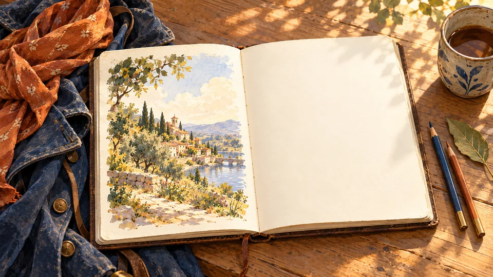
Imagine coming into the workshop after an afternoon in the square. There is sunlight on the table, a map left open and a puzzle somebody has begun. You might first look out towards the harbour. Then something on the page catches your interest, and you pull up a chair. I like that small sequence: arriving, feeling welcome, finding something you want to explore.
That is the emotional invitation behind Marlow’s fieldbook world. The illustrations offer places and company; the page gives your curiosity somewhere to go. I want the first impression to carry warmth and possibility, and the time that follows to offer the satisfaction of becoming involved in something.
The colours of the workshop
Cream provides the paper-like foundation. Indigo is the ink, giving words and shapes a steady dark structure. Rust brings warmth to an accent, much as my scarf does to a coat. Together they connect the screens with the workshop and the coastal town around it. They are familiar materials for a world that can hold both a quiet puzzle and a lively afternoon.
The way we use those colours matters. A generous plain surface leaves room for the thing you want to understand. A small accent can draw the eye towards an invitation. A painting at the edge of the activity can suggest an interesting place beyond it. The intention is a welcome that gradually gives way to attention as you begin.
Reading comfortably supports that journey. Words need enough contrast, and useful differences need more than colour alone: a shape, a label or another clear cue. When information is easy to distinguish, you can spend more of your attention on the decision itself. Those choices need checking in the actual interface, where size, background and context all come together.
A page that carries the thought
The website direction pairs Fraunces for short headings with Atkinson Hyperlegible Next for body and functional text. The heading offers some of the fieldbook’s character. The longer passages carry an explanation at a comfortable pace, with space between lines and enough room for a thought to develop. Each has a part in making the page inviting to enter and pleasant to stay with.
The same care takes different forms on a watch, a phone and a large screen. A short instruction should be easy to find when you need it. A story needs room to unfold. I would like the shared identity to feel familiar across those places while allowing each activity the space and clarity it requires.
From looking around to becoming absorbed
Imagine laying a number puzzle on my table. At first you notice the harbour through the window and a boat approaching the quay. As the puzzle draws you in, your attention settles on the relationships in the grid. The view remains part of the room. The numbers have become the interesting thing.
That movement from welcome into concentration is an important part of the design. A background can establish the setting, then leave the grid and your notes clear. An explanation can help you notice the relationship you were missing. An understandable response to a move can let you continue the thought. Several modest choices support the pleasure of finding your way into a problem.
Other experiences will ask for a different emotional rhythm. A concert scene can be full of anticipation and movement. A village gathering can show shared delight. The world has room for those livelier moments, with clear controls around them. Warmth gives the family a resemblance; the activity and occasion give each experience its own character.
A place to return to
Familiarity has its own pleasure. A coat on a peg, a fieldbook on the table and a path down to the harbour can become recognizable parts of Marlow’s world. Over time, I hope the pleasure of arriving will include remembering a good puzzle, an amusing encounter or a story you want to continue. The artwork can hold the invitation open.
The illustration accompanying this article is a study of that world. On the website, the words remain real, readable text on a plain surface, with the image beside the reading experience. The page should reward the curiosity that brought you to it: something worth seeing, something worth thinking about, and room to enjoy both.